Psychology of Visual Content: Why We Remember Videos

Have you ever wondered why certain videos stick with us long after…
Have you ever wondered why certain videos stick with us long after…
Building brand awareness from the ground up may seem like a daunting…
Video marketing isn’t just for big brands with massive budgets anymore. Thanks…

YouTube isn’t just a video-sharing platform—it’s the second largest search engine in…

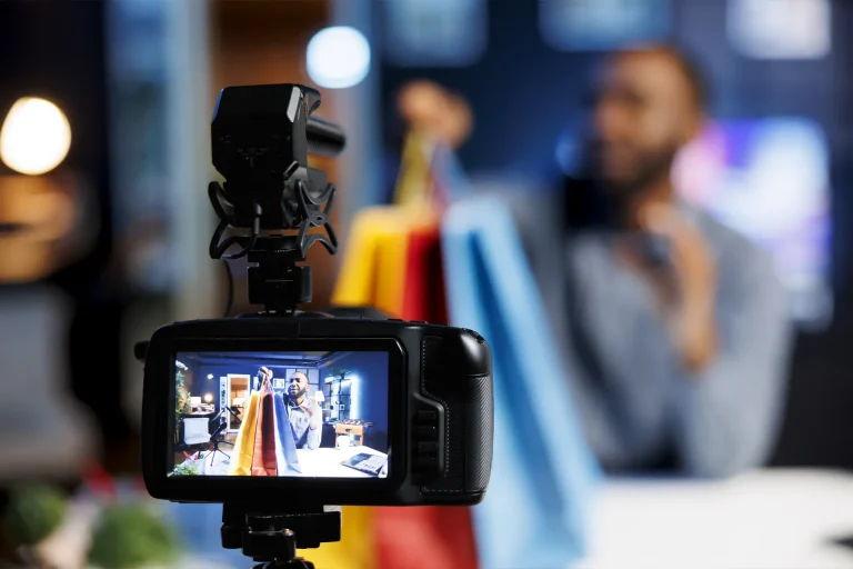
Video content has quickly become one of the most powerful tools in…

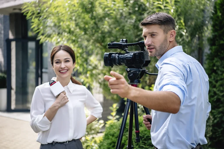
In the fast-paced world of digital marketing, promotional videos have become an…